When it comes to web design, every detail matters. Check out 3 real-life examples of websites with poor performance in terms of visibility optimization, website speed, copywriting and more – all the common errors that designers should avoid.

When it comes to web design, every detail matters. Check out 3 real-life examples of websites with poor performance in terms of visibility optimization, website speed, copywriting and more – all the common errors that designers should avoid.


p.a. gmbh may have some innovative software solutions to offer, but their website design and visuals leave much to be desired. It is on top of our bad website examples for several reasons.
The color selection could do with an update, while the stock images are just passable. Additionally, there is a lack of effective copy that speaks directly to the needs and wants of potential clients - instead it simply provides descriptions of services available. To top it off, any kind of CTA or contact button seems absent from the home page; even 'Career' appears highlighted in its place instead of “Contacts”!
Clearly this company needs to look into revamping its web presence as soon as possible. Our full video review below dives deeper into the reasons why this is so critical.

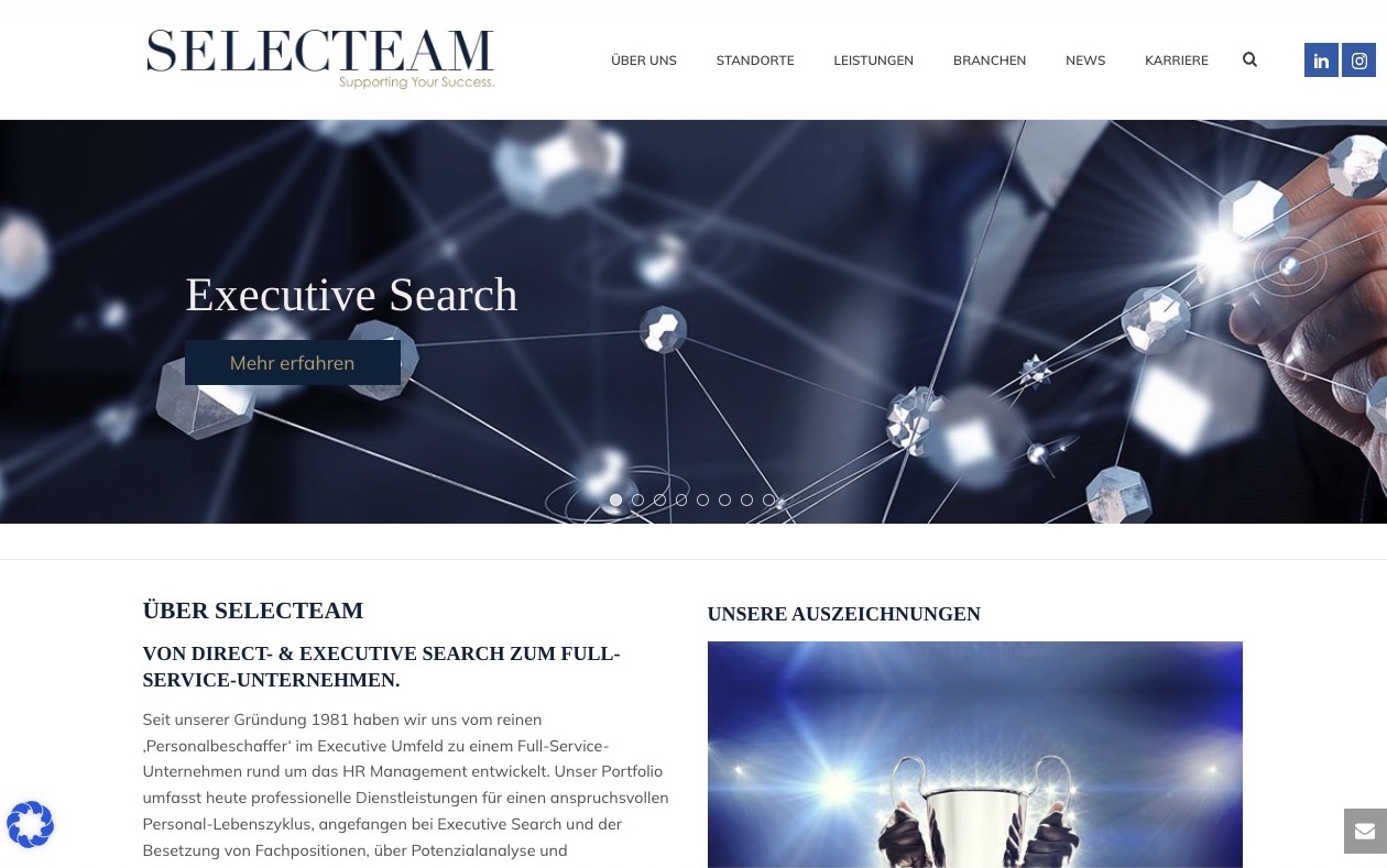
Select Team provides HR management services, but this bad website example falls short in terms of design, copy and features.
On first impression it’s difficult to understand what they offer due to sloppy stock images which don't contrast well with background colors; while headings like 'Supporting Your Success' lack detail making comprehension even harder for visitors new to their site.
The copy on this website fails to convey how it can satisfy potential clients' needs. There is also no call-to-action (CTA) element included, a key factor for an effective website. Moreover, its mobile and desktop speed tests could be improved as they are lower than the industry benchmark.
With some key improvements, SelectTeam could stand out from other service providers in this sector and be more successful!


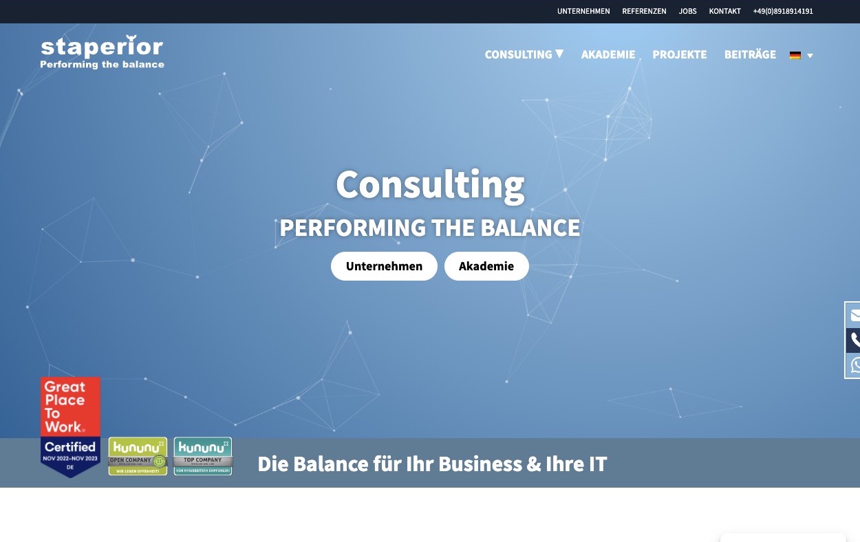
With an outdated and uninspired design, the website's presentation offers little to capture attention.
The copywriting fails to provide a glimpse of how its services can benefit prospective clients; instead, it largely focuses on company information without conveying its purpose or mission statement clearly.
To attract visitors and encourage engagement with potential customers, they need more concise messaging that emphasizes their value-adding capabilities in order to stand out from competitors in the digital space.
The CTA of this website is in need of refinement to provide a more convincing message. Aside from that, poor copy and missing elements render it one of the bad website examples out there. When looking at speed tests, however, mobile devices are fairing better than computers on performance results for this site.
Our full video review below provides an in-depth look into each argument, complete with examples.
To maximize your online potential, take note of the mistakes made by Informatik & Datenbanksysteme, Select Team, and Staperior Consulting GmbH. By avoiding their blunders in web design, you can ensure a polished virtual presence that displays the best qualities of both yourself and your business.
Have you noticed areas that need improvement on your website? Take advantage of our limited-time special offer to get a comprehensive audit for free, which will provide actionable insights in the form of video and text summaries. Investing time into improving your site can pay off - don't wait! Get started now.